When discussing layouts, I'm talking about how elements are arranged on a page. The key CSS properties involved are:
display— typicallygridorflexin modern developmentmarginpaddingwidthheightpositiontop,left,bottom,right
I sometimes add border-width to this list as well.
Here's my main point:
Tailwind excels at layout construction.
There are several compelling reasons for this.
First: Layout styles are tightly coupled to HTML structure
Separating layouts into CSS files forces you to mentally reconstruct the structure. Consider this three-column grid example in traditional HTML and CSS:
<div class="grid">
<div class="grid-item"></div>
<div class="grid-item"></div>
</div>
.grid {
display: grid;
grid-template-columns: 2fr 1fr;
.grid-item:first-child {
grid-column: span 2
}
.grid-item:last-child {
grid-column: span 1
}
}
Hide the HTML and read only the CSS. Notice how you need to mentally reconstruct the structure it applies to.
Now consider the same layout using Tailwind utilities:
<div class="grid grid-cols-3">
<div class="col-span-2"></div>
<div class="col-span-1"></div>
</div>
The layout becomes immediately apparent: a three-column grid where the first item spans two columns and the second spans one.
The syntax grid-cols-3 and col-span-2 can feel unfamiliar as you parse Tailwind's conventions.
But watch what happens when we use CSS variables instead. The layout becomes instantly clear:
<div class="grid-simple [--cols:3]">
<div class="[--span:2]"> ... </div>
<div class="[--span:1]"> ... </div>
</div>
Same three-column layout.
This approach makes layouts easier to write, read, and visualize. It offers additional benefits as well, which you can explore in its documentation.
Let's continue.
Why not use 2fr 1fr?
Using 2fr 1fr for a three-column grid seems logical, right?
.grid {
display: grid;
grid-template-columns: 2fr 1fr;
}
It doesn't work as expected. The fr unit calculates based on available space after subtracting grid gaps.
Since 2fr 1fr defines only two columns, the result differs from a standard three-column grid.
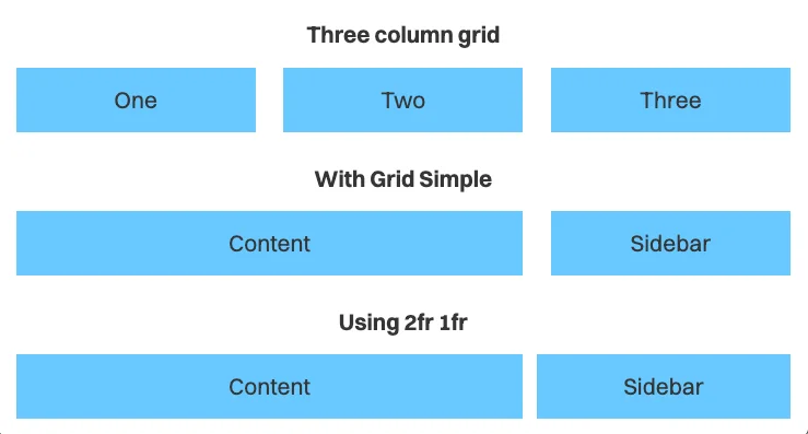
Now let's look at more reasons Tailwind works well for layouts.
Second: Naming layouts becomes unnecessary
Layouts are notoriously difficult to name. My typical naming patterns are:
- Number-based, like
.two-columns - Semantic, like
.content-sidebar
These names don't fully describe the layout. Even .two-columns is ambiguous because it could mean:
- Two equal columns
- Two columns with
1fr auto - Two columns with
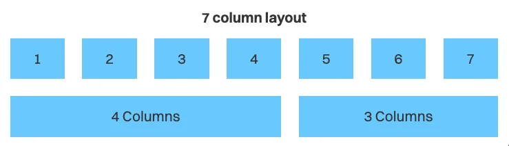
auto 1fr - Two columns spanning seven total units where the first takes four and the second takes three...
That last example is already getting confusing to explain.
Instead of forcing names, we can let the numbers communicate the structure directly:
<div class="grid-simple [--cols:7]">
<div class="[--span:4]"> ... </div>
<div class="[--span:3]"> ... </div>
</div>
The variables tell the story visually.
Third: Layout requirements vary by context
A "two-column" layout might need different properties in different contexts. Here's an example.
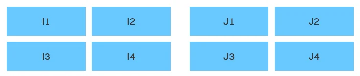
Notice that:
- A larger
gapseparates the I and J groups - A smaller
gapis used within each group
The gap difference is subtle but signals that items belong to separate groups.
Here's a real-world example. Notice the gap difference between elements within the newsletter container versus the gap between the newsletter and quote containers.

If this layout appears only once, there's no need for a modifier class. We can adjust the gap directly.
<div class="grid-simple [--cols:2] gap-8">
<div class="grid-simple gap-4 [--cols:2]"> ... </div>
<div class="grid-simple gap-4 [--cols:2]"> ... </div>
</div>
Another common example
Consider a marketing section heading. It often looks better when you adjust its max-width to prevent orphaned text.
While text-balance might work, manual positioning often produces better results.
Without Tailwind, you'd likely use an inline style:
<h2 class="h2" style="max-width: 12em;">
Your subscription has been confirmed
</h2>
With Tailwind, you can specify max-width more concisely:
<h2 class="h2 max-w-[12em]">
Your subscription has been confirmed
</h2>
Fourth: Responsive variants can be created instantly
The breakpoint at which layouts change is another important consideration — call it the responsive factor.
Similar layouts typically share the same responsive factor, making it sensible to group them into a named layout.
.two-column {
@apply grid-simple;
/* --cols: 1 is the default */
@media (width >= 800px) {
--cols:2;
}
}
But you might need layouts that are two columns on mobile and expand to many more columns on larger screens. This pattern commonly appears in site footers.
Since the footer grid is unique, we can use Tailwind's responsive variants to adjust the layout inline.
<div class="grid-simple [--cols:2] md:[--cols:5]">
<!-- span set to 1 by default so there's no need to specify them -->
<div> ... </div>
<div> ... </div>
<div> ... </div>
<div> ... </div>
<div> ... </div>
<div> ... </div>
</div>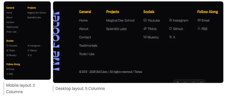
Once again, we create a new layout without adding modifier classes — keeping our CSS clean and focused.
How to best use Tailwind
This article is a sample lesson from my course, Unorthodox Tailwind, where I demonstrate how to use Tailwind and CSS together effectively.
In my view, the optimal approach to Tailwind isn't cluttering your HTML with utilities, but rather creating utilities that enable easy layout and style creation.
The course covers much more if you're interested in learning this approach.
4 Reasons That Make Tailwind Great for Building Layouts originally handwritten and published with love on CSS-Tricks. You should really get the newsletter as well.