Scroll-driven animations have captured developers' attention over the past few years, and they're about to become baseline once Firefox adds support without requiring a flag. As part of Interop 2026, that milestone should arrive soon. The concept is elegant: an animation timeline's progress syncs directly with scroll position—scroll halfway down the page, and you're halfway through the animation. Best of all, implementation is straightforward.
Another CSS feature generating buzz is the corner-shape property, currently Chrome-only. It unlocks corner styles beyond simple rounding, enabling distinctive geometric shapes with minimal code. The real power lies in its mathematical foundation, making it perfectly suited for animation.
Combine these two capabilities and you get scroll-driven corner-shape animations (Chrome 139+ required):
corner-shape fundamentals
The corner-shape property accepts keyword values that correspond to superellipse() function outputs:
corner-shape keyword | superellipse() equivalent |
|---|---|
square | superellipse(infinity) |
squircle | superellipse(2) |
round | superellipse(1) |
bevel | superellipse(0) |
scoop | superellipse(-1) |
notch | superellipse(-infinity) |
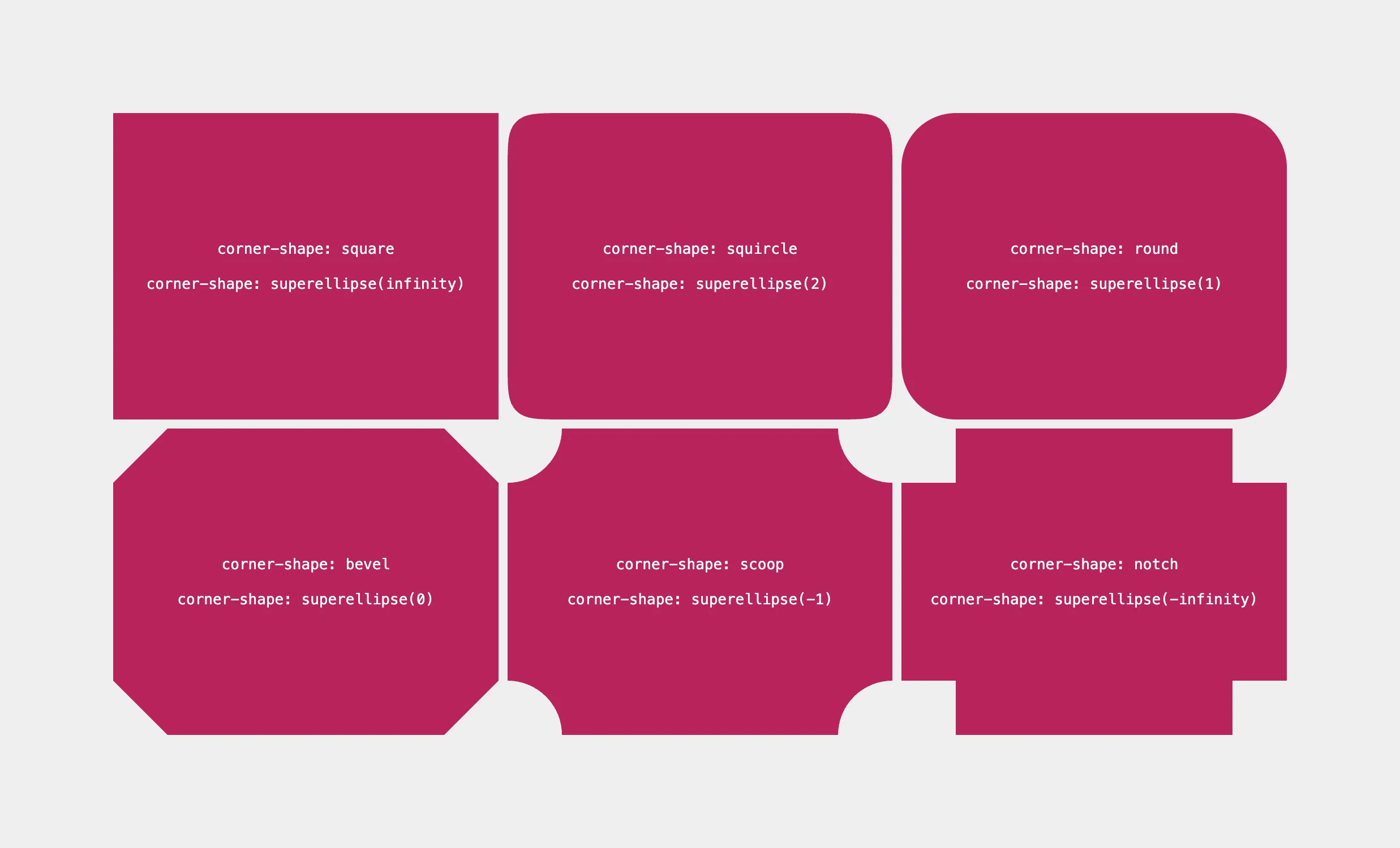
These keywords are shortcuts for the underlying superellipse() function, which uses mathematical equations to generate corner shapes. For instance, superellipse(2) produces the "squircle"—a shape between square and circle. Since the function is mathematical at its core, it's inherently animatable, which opens up the possibilities we're exploring here.
Building the animation
Here's the complete CSS for the effect, followed by a breakdown:
@keyframes bend-it-like-beckham {
from {
corner-shape: superellipse(notch);
/* or */
corner-shape: superellipse(-infinity);
}
to {
corner-shape: superellipse(square);
/* or */
corner-shape: superellipse(infinity);
}
}
body::before {
/* Fill viewport */
content: "";
position: fixed;
inset: 0;
/* Enable click-through */
pointer-events: none;
/* Invert underlying layer */
mix-blend-mode: difference;
background: white;
/* Don't forget this! */
border-bottom-left-radius: 100%;
/* Animation settings */
animation: bend-it-like-beckham;
animation-timeline: scroll();
}
/* Added to cards */
.no-filter {
isolation: isolate;
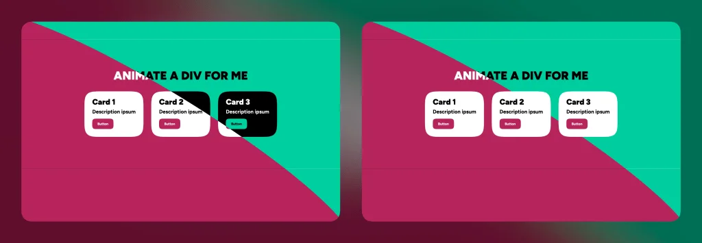
}The body::before pseudo-element with content: "" creates an empty layer that's fixed to the viewport edges via inset: 0. Since this animated shape sits above the content, pointer-events: none ensures users can still interact with underlying elements.
The visual effect uses mix-blend-mode: difference with a white background to invert colors beneath it—a popular technique that maintains reasonable contrast in most cases. To exclude specific elements from this effect, apply this utility class:
/* Added to cards */
.no-filter {
isolation: isolate;
}
The corner-shape property requires border-radius to function. Here's an important detail: border-radius doesn't actually round corners—it defines the x and y coordinates for the corner shape, while corner-shape: round (the default) handles the actual rounding:
/* Syntax */
border-bottom-left-radius: <x-axis-coord> <y-axis-coord>;
/* Usage */
border-bottom-left-radius: 50% 50%;
/* Or */
border-bottom-left-radius: 50%;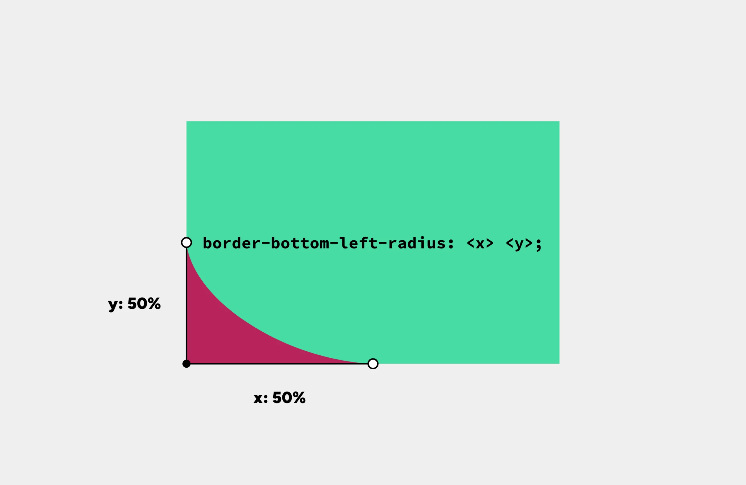
We're using border-bottom-left-radius: 100% to position those coordinates at the far end of each axis. The @keyframes animation overrides the default corner-shape: round, referenced via animation: bend-it-like-beckham. No duration is needed since animation-timeline: scroll() ties the animation to scroll progress.
The keyframes animate from corner-shape: superellipse(notch) (an inset square, equivalent to superellipse(-infinity)) to corner-shape: superellipse(square) (an outset square, or superellipse(infinity)).
Refining the animation
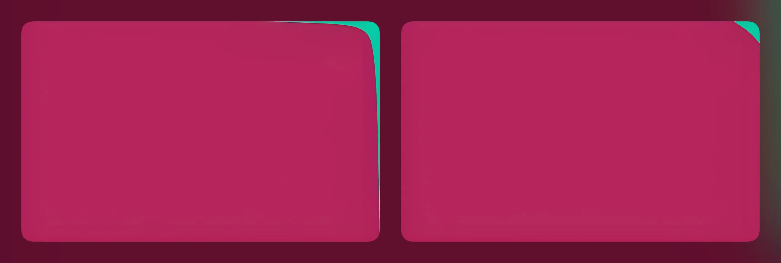
The initial demo has a subtle issue worth addressing. At the animation's start and end, the curvature appears harsh because we're using the extreme notch and square values. The shape also seems to get pulled into the corners, and being constrained to the viewport edges feels restrictive.
The fix is simple:
/* Change this... */
inset: 0;
/* ...to this */
inset: -1rem;
This extends the shape beyond the viewport boundaries. While this makes the animation appear to start late and end early, we can compensate by avoiding the extreme -infinity and infinity values:
@keyframes bend-it-like-beckham {
from {
corner-shape: superellipse(-6);
}
to {
corner-shape: superellipse(6);
}
}
This keeps part of the shape visible throughout, but adjusting the superellipse() value ensures it stays outside the viewport when needed. Here's the difference:
And here's the refined version:
Expanding scroll capabilities
Scroll-driven animations integrate seamlessly with other CSS scroll features, including scroll snapping, scroll buttons, scroll markers, text fragments, and JavaScript scroll methods like scrollTo(), scroll(), scrollBy(), and scrollIntoView().
Adding scroll snapping to complement an existing scroll-driven corner-shape animation requires just a few lines of CSS:
:root {
/* Snap vertically */
scroll-snap-type: y;
section {
/* Snap to section start */
scroll-snap-align: start;
}
}Creating masks with corner-shape
Here's a technique that uses corner-shape as a masking layer. By placing a border around the viewport and overlaying a notched shape (corner-shape: notch) with the same background color (background: inherit), the shape initially conceals the border completely. As you scroll, the animation progressively reveals the border's four corners:
Making the shape more visible reveals an additional detail: the shape rotates slightly (rotate: 5deg), adding visual interest to the effect.
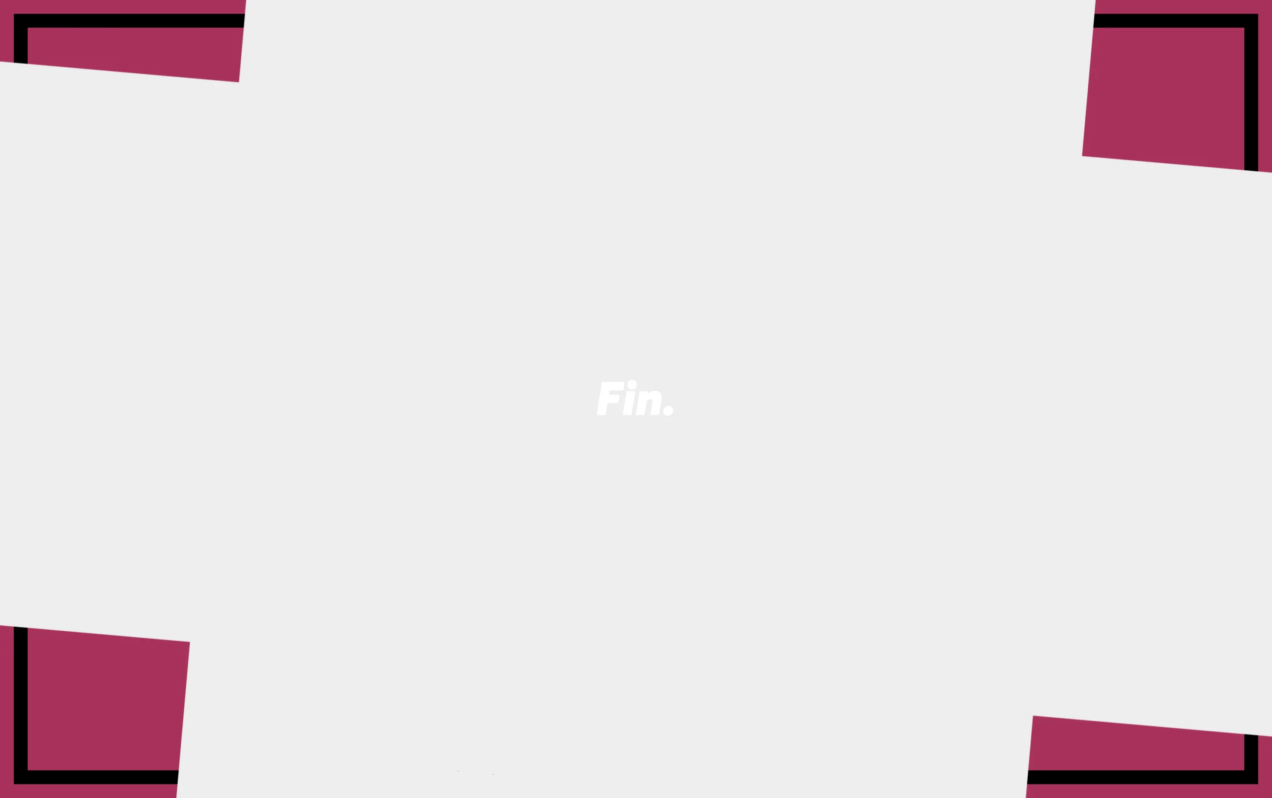
This implementation animates border-radius rather than corner-shape directly. The animation target of border-radius: 20vw / 20vh uses viewport-relative units where 20vw and 20vh control the x-axis and y-axis curvature of each corner. This reveals 20% of the border as scrolling progresses.
One implementation detail: proper z-index management ensures content appears above both the border and the masking shape. Beyond that consideration, this demonstrates another creative application of corner-shape:
@keyframes tech-corners {
from {
border-radius: 0;
}
to {
border-radius: 20vw / 20vh;
}
}
/* Border */
body::before {
/* Fill (- 1rem) */
content: "";
position: fixed;
inset: 1rem;
border: 1rem solid black;
}
/* Notch */
body::after {
/* Fill (+ 3rem) */
content: "";
position: fixed;
inset: -3rem;
/* Rotated shape */
background: inherit;
rotate: 5deg;
corner-shape: notch;
/* Animation settings */
animation: tech-corners;
animation-timeline: scroll();
}
main {
/* Stacking fix */
position: relative;
z-index: 1;
}
Animating multiple corner-shape elements
This demonstration features nested diamond shapes created with corner-shape: bevel. All diamonds share a single scroll-driven animation that expands their size through padding adjustments:
<div id="diamonds">
<div>
<div>
<div>
<div>
<div>
<div>
<div>
<div>
<div>
<div></div>
</div>
</div>
</div>
</div>
</div>
</div>
</div>
</div>
</div>
</div>
<main>
<!-- Content -->
</main>
@keyframes diamonds-are-forever {
from {
padding: 7rem;
}
to {
padding: 14rem;
}
}
#diamonds {
/* Center them */
position: fixed;
inset: 50% auto auto 50%;
translate: -50% -50%;
/* #diamonds, the <div>s within */
&, div {
corner-shape: bevel;
border-radius: 100%;
animation: diamonds-are-forever;
animation-timeline: scroll();
border: 0.0625rem solid #00000030;
}
}
main {
/* Stacking fix */
position: relative;
z-index: 1;
}Wrapping up
These examples demonstrate animating between custom superellipse() values, using corner-shape as a masking technique to generate novel shapes, and coordinating animations across multiple corner-shape elements simultaneously. The possibilities extend far beyond simple keyword transitions—especially when combined with scroll-driven animations to create compelling interactive effects. These techniques work equally well as static designs or dynamic scroll-based experiences.
Experimenting With Scroll-Driven corner-shape Animations originally handwritten and published with love on CSS-Tricks. You should really get the newsletter as well.