Building basic shapes like rectangles, circles, and rounded rectangles in CSS is straightforward. More intricate CSS shapes like triangles, hexagons, stars, and hearts present a greater challenge, though modern CSS features make them manageable.
The real difficulty emerges when creating shapes with organic curves and irregular edges.
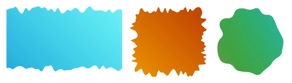
These irregular forms go by many names—wavy, wiggly, blob-like, squiggly, ragged, or torn edges. Regardless of terminology, they're notoriously difficult to produce with pure CSS and typically require SVG or image-based solutions. The new shape() function changes this, enabling CSS-based creation of these complex forms.
Make no mistake: these shapes require significant mathematical calculation and aren't simple to build from scratch. That's why I've developed several generators that let you grab ready-to-use code instantly.
Simply adjust the parameters and copy the generated code. It's that efficient.
While you might be tempted to bookmark these tools and move on, understanding the underlying mechanics is valuable. Knowing how these shapes work enables you to customize the code and create unique variations. We'll also explore practical examples worth sticking around for.
Notice: If you're unfamiliar with shape(), check out my four-part series covering the fundamentals. It provides essential context for what follows.
How does it work?
Despite their visual diversity, all shapes from these generators use the same core technique: multiple curve commands. The key is ensuring adjacent curves connect smoothly, creating the appearance of one continuous, flowing line.
Here's what a single curve command produces using one control point:
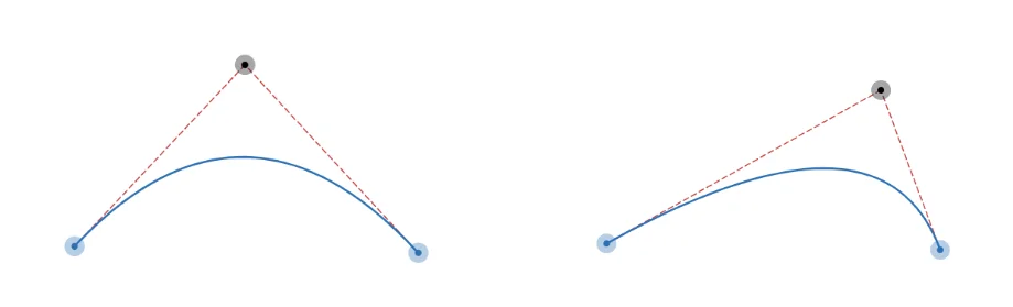
When we place two curves consecutively:
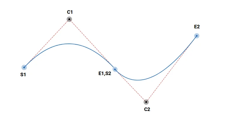
The first curve's endpoint (E1) becomes the second curve's starting point (S2). This shared point must lie on the line segment between control points C1 and C2. Meeting this criterion produces a smooth, continuous curve. Violating it creates a jarring discontinuity.
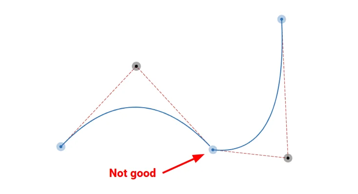
The solution is generating random curves while maintaining this continuity rule. To simplify, I position the shared point at the midpoint between consecutive control points, reducing complexity.
Creating the shapes
Let's begin with the simplest form: a wavy divider with randomized curves on one edge.
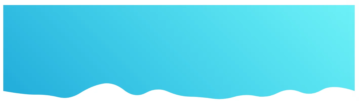
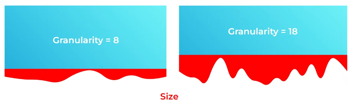
Two parameters control the output: granularity and size. Granularity determines the number of curves (as an integer), while size defines the vertical space available for curve variation.
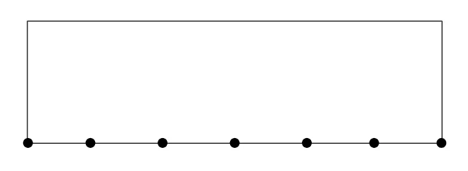
First, we create N evenly-spaced points along the element's bottom edge (where N equals the granularity value).
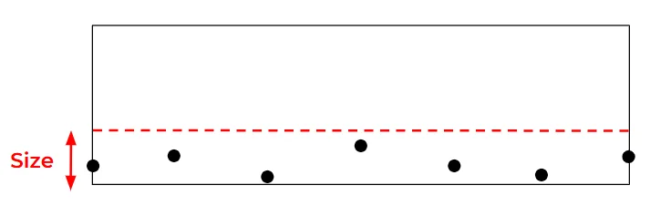
Next, we randomly offset each point's vertical position using the size parameter. Each offset is a random value between 0 and the size value.
Then we calculate the midpoint between each pair of adjacent points, generating additional points.
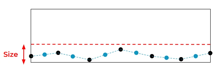
The pattern becomes clear: one set of randomly-positioned points, another set positioned to satisfy our smoothness criterion. We then draw curves through all points to complete the shape.
The resulting CSS structure:
.shape {
clip-path: shape(from Px1 Py1,
curve to Px2 Py2 with Cx1 Cy1,
curve to Px3 Py3 with Cx2 Cy2,
/* ... */
curve to Pxi Pyi with Cx(i-1) Cy(i-1)
/* ... */
)
}
The Ci points are randomly positioned control points, while Pi points are the calculated midpoints.
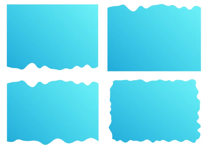
Applying this technique to different edges produces various configurations (bottom only, top only, top and bottom, all sides, etc.).
For blob shapes, the approach differs slightly. Instead of rectangular edges and straight lines, we work with circular geometry.
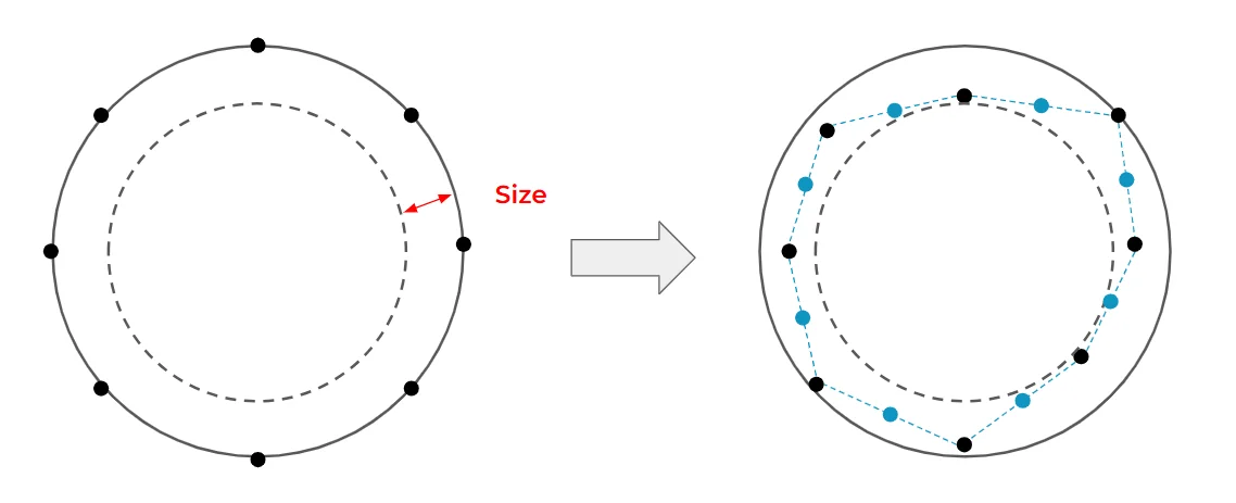
Points are distributed evenly around a circle (matching an element with border-radius: 50%), then randomly offset toward the center. After adding midpoints, we draw the curves to form the blob.
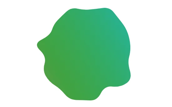
We can combine both techniques to create rounded rectangles with irregular edges.
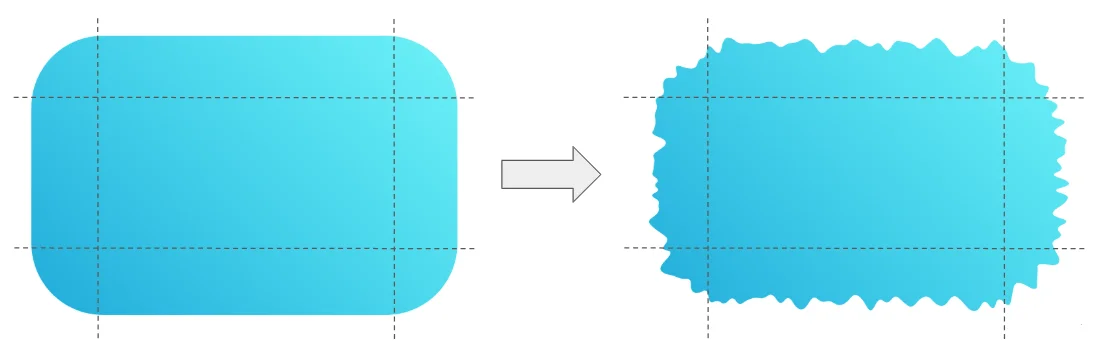
This proved the most complex implementation, requiring careful handling of corners, edges, and varying granularities. The payoff is substantial—it enables creation of diverse decorative frames.
Show me the cool demos!
Let's move from theory to practice with examples demonstrating how these generators simplify creating sophisticated shapes and animations.
Here's a standard layout incorporating multiple wavy dividers:
This demo contains four shapes, each copied directly from the wavy divider generator. The header applies the bottom configuration, the footer uses the top configuration, and remaining elements use the combined top and bottom configuration.
Now let's enhance things with animation.
Each animated element follows this pattern:
@media screen and (prefers-reduced-motion: no-preference) {
.element {
--s1: shape( ... );
--s2: shape( ... );
animation: dance linear 1.6s infinite alternate;
}
@keyframes dance {
0% {clip-path: var(--s1)}
to {clip-path: var(--s2)}
}
}
The workflow is straightforward: set your granularity and size in the generator, then produce two distinct shapes — one for --s1 and one for --s2. Because both shapes share the same number of curves, the browser can smoothly interpolate between them, producing a fluid, organic animation.
Want to tie that animation to the user's scroll position instead? Simply add animation-timeline: scroll() and the browser handles the rest.
The same technique works equally well with a sticky header:
In this case the key is playing with the size parameter. Lock in your granularity and shape ID, then set the initial shape's size to 0 — which produces a plain rectangle — and give the second shape a non-zero size to get a wavy edge. The browser animates seamlessly between the two.
The design space here is genuinely wide open. These shapes work as static decorative elements, but the real payoff comes from pairing two shapes that share the same granularity and letting the browser animate between them as you adjust size and shape ID.
What can you build with these techniques? Share your demos in the comments.
In the meantime, here are a few more examples to spark ideas:
A bouncing hover effect using blob shapes:
A squishy button with hover and click states:
And a collection of fancy CSS loaders built on the same principles.
Conclusion
The new shape() function is a meaningful addition to the CSS toolbox. It lets you define complex, expressive shapes entirely in CSS — no SVG, no images — while keeping transitions and animations well within reach.
Bookmark the CSS Generators site to grab ready-to-use code for everything covered here and more. The CSS Shape site is also being updated to leverage shape() throughout, which should streamline a lot of existing code.
Is there a complex shape you'd like to see tackled with shape()? Drop it in the comments — it might just become the next generator.
To close things out, here's a CSS-only portrait of Chris Coyier — rendered entirely with shape():
Every drawing is a single div with a single shape() implementation. The code was generated with an SVG-to-CSS converter and supporting tools, but it stands as a compelling illustration of just how far this function can take you.
Making Complex CSS Shapes Using shape() originally handwritten and published with love on CSS-Tricks. You should really get the newsletter as well.