Multi-column layouts have long been underutilized on the web, primarily due to a critical usability flaw: when content overflowed the container, it triggered horizontal scrolling. This behavior clashes with modern web conventions where vertical scrolling is the expected default.
Consider this common scenario:
The CSS behind this layout looks like:
body {
  max-width: 700px;
}
.article {
  column-gap: 10px;
  column-count: 3;
  height: 350px;
}
When content exceeds the container dimensions, the multi-column system generates additional columns horizontally, forcing an awkward sideways scroll. Chrome 145 introduces a solution to this longstanding problem.
Chrome 145 ships with column-height and column-wrap properties that allow overflow content to wrap into new rows below the initial columns, maintaining the natural vertical scroll pattern users expect.
Here's the updated approach in Chrome 145+:
body {
  max-width: 700px;
}
.article {
  column-gap: 10px;
  column-count: 3;
  column-wrap: wrap;
  height: 350px;
}
This produces a clean multi-column layout that respects the specified column-count:
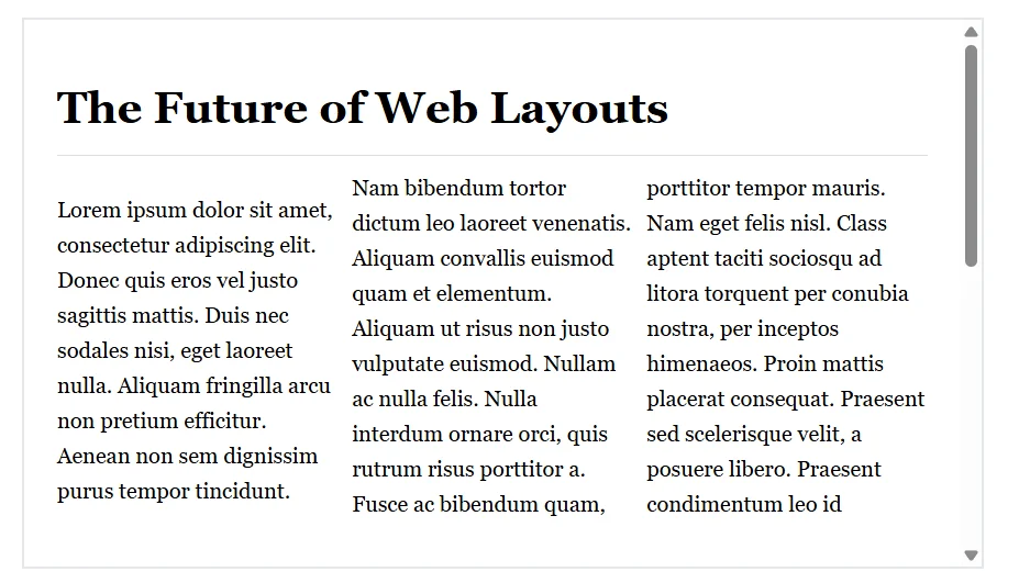
This transforms multi-column layouts into true 2D flows, creating a more intuitive scrolling experience for web content.
⚠️ Browser Support: As of April 2026, column-wrap and column-height are available in Chrome 145+. Firefox, Safari, and Edge do not yet support these properties.
Practical applications
These new properties shine in specific scenarios:
Fixed-height content blocks
When working with content that has predictable dimensions—like card grids with maximum heights—these properties deliver excellent results.
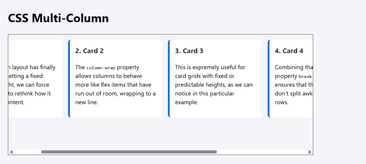
Compare column-wrap: wrap versus column-wrap: nowrap in this demo (requires Chrome 145+):
Without support, you'll see the nowrap behavior:
With wrap enabled:
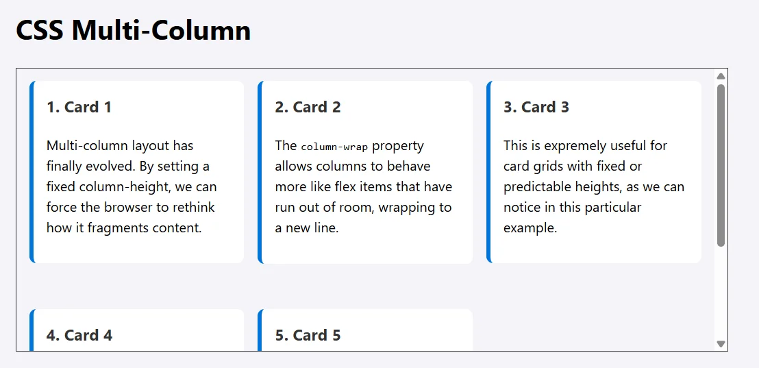
The wrapping creates a significantly smoother flow.
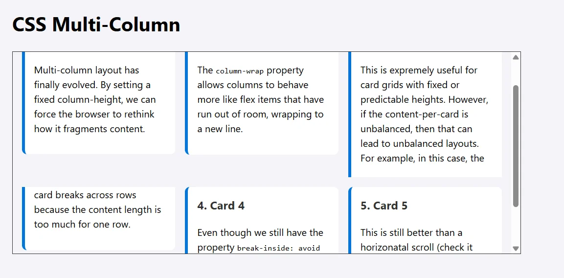
One caveat: unbalanced content within cards can still produce irregular layouts:
Editorial layouts
For newspaper or magazine-style designs where you're comfortable setting explicit container and column heights, the combination of column-height and column-wrap creates responsive layouts that maintain logical content flow across different screen sizes.
Vertical pagination
This is particularly compelling: by setting column height to viewport height (like 100dvh), you can create a pagination system where content fills the screen vertically before wrapping. Combined with scroll-snap-type: y mandatory, this produces a smooth page-flipping experience without JavaScript calculations.
Try this demo (Chrome 145+ required for vertical scrolling; otherwise you'll get horizontal scroll):
The tradeoff: when individual slides contain excessive content, the vertical flow can feel disrupted by the imbalance.
Current limitations
While useful, these properties aren't universal solutions for multi-column design challenges.
Unknown content heights
When content height is unpredictable—user-generated content, CMS-driven pages—these properties offer limited value. While column-wrap handles vertical overflow, layouts remain unpredictable without fixed column heights. You'll either overestimate heights (creating awkward gaps) or underestimate them (producing unbalanced columns). Resorting to JavaScript for height calculations undermines the CSS-native approach.
Media query dependency
True responsive layouts still require media queries to adjust column-count and column-height across viewport sizes. While wrapping improves overflow behavior, it doesn't eliminate the need for breakpoint-based adjustments.
Precise positioning
For layouts requiring exact control over item relationships, CSS Grid remains superior. Multi-column with wrapping provides flow but lacks granular positioning control.
How it compares to other layout methods
Multi-column with wrapping occupies a distinct niche compared to CSS Grid, Flexbox, and the emerging CSS Masonry.
The key distinction: while Grid and Flexbox manage discrete containers, multi-column uniquely fragments continuous content streams across columns and rows. This makes it ideal for long-form content like newspaper layouts.
CSS Grid excels at complex layouts requiring precise positioning or asymmetric designs—dashboards, responsive galleries that need to auto-fit based on screen size.
Flexbox with wrapping suits standard UI components like navigation bars and tag clouds that should reflow on smaller screens.

Note: Chrome is also experimenting with a new flex-wrap: balance keyword for enhanced wrapping control.
Grid and Flexbox with wrapping work best for layouts with independent items, handling dynamic heights well and providing better alignment control than multi-column. However, multi-column with these new properties has the advantage for fragmentation-aware layouts.
CSS Masonry will be valuable for interlocking items with varying heights—perfect for Pinterest-style boards or e-commerce product displays where descriptions and images create differing card heights.
The bottom line
Chrome 145's column-wrap and column-height properties meaningfully expand multi-column layout capabilities. By enabling 2D content flows, they solve the horizontal scrolling problem that has limited multi-column adoption.
These features won't replace Grid's structural precision or Flexbox's item-based flexibility, but they fill a unique role. As browser support expands, the key is understanding both the strengths and constraints of multi-column layouts. They won't handle dynamic heights or eliminate media queries, but they enable flowing continuous content in 2D space—something the other layout systems can't do quite the same way.
Looking at New CSS Multi-Column Layout Wrapping Features originally handwritten and published with love on CSS-Tricks. You should really get the newsletter as well.